Visual Identity & Design

Sacred/Saint n' Faith

About the project

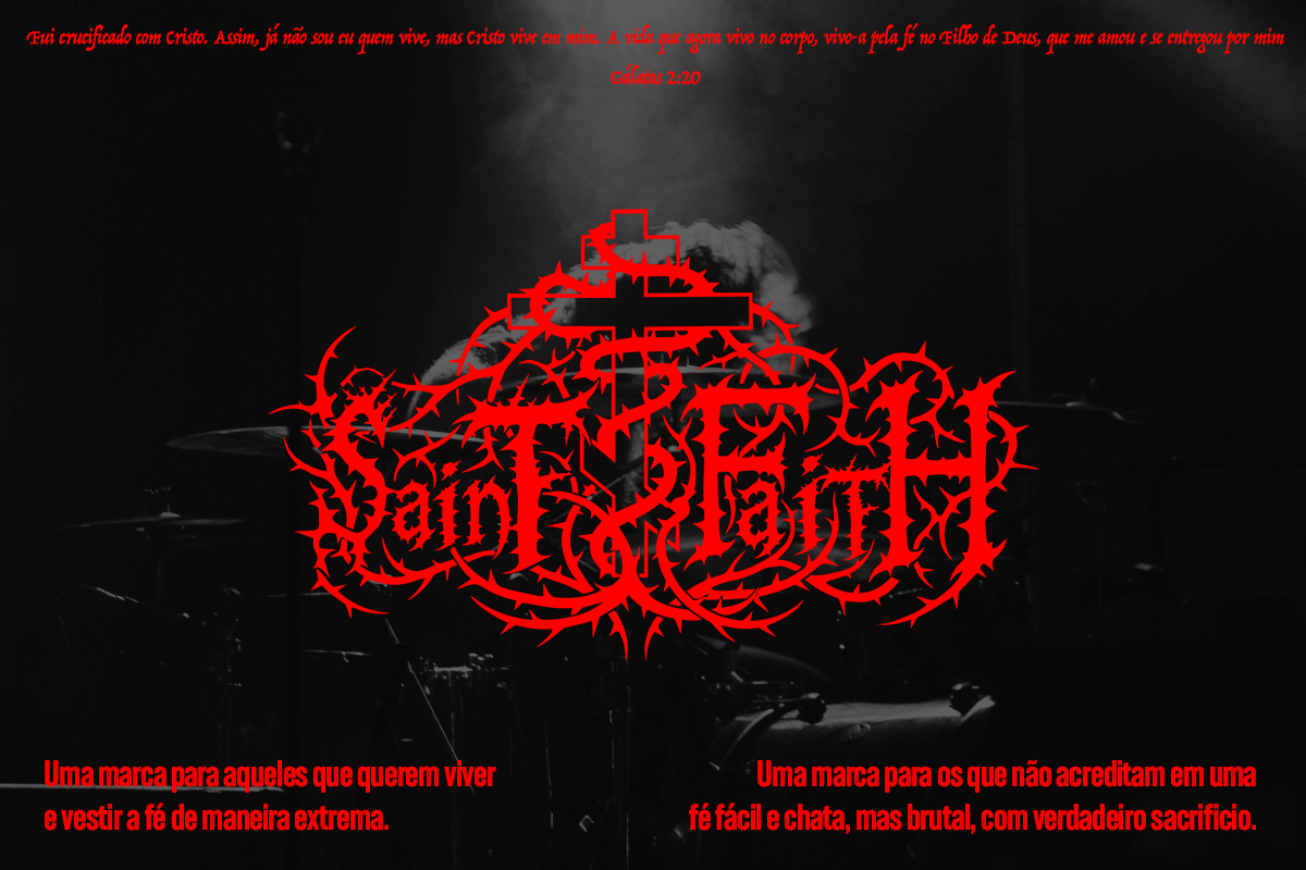
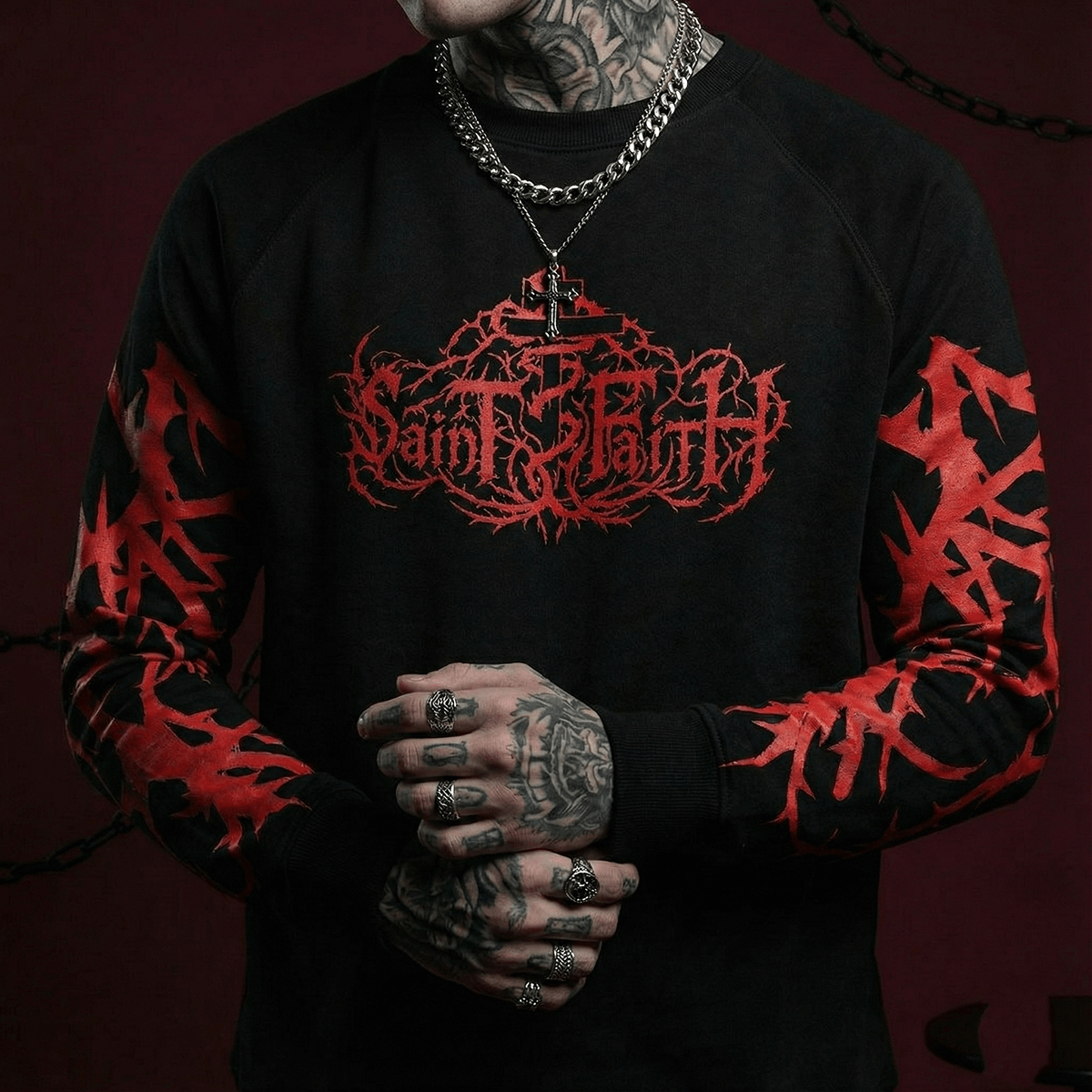
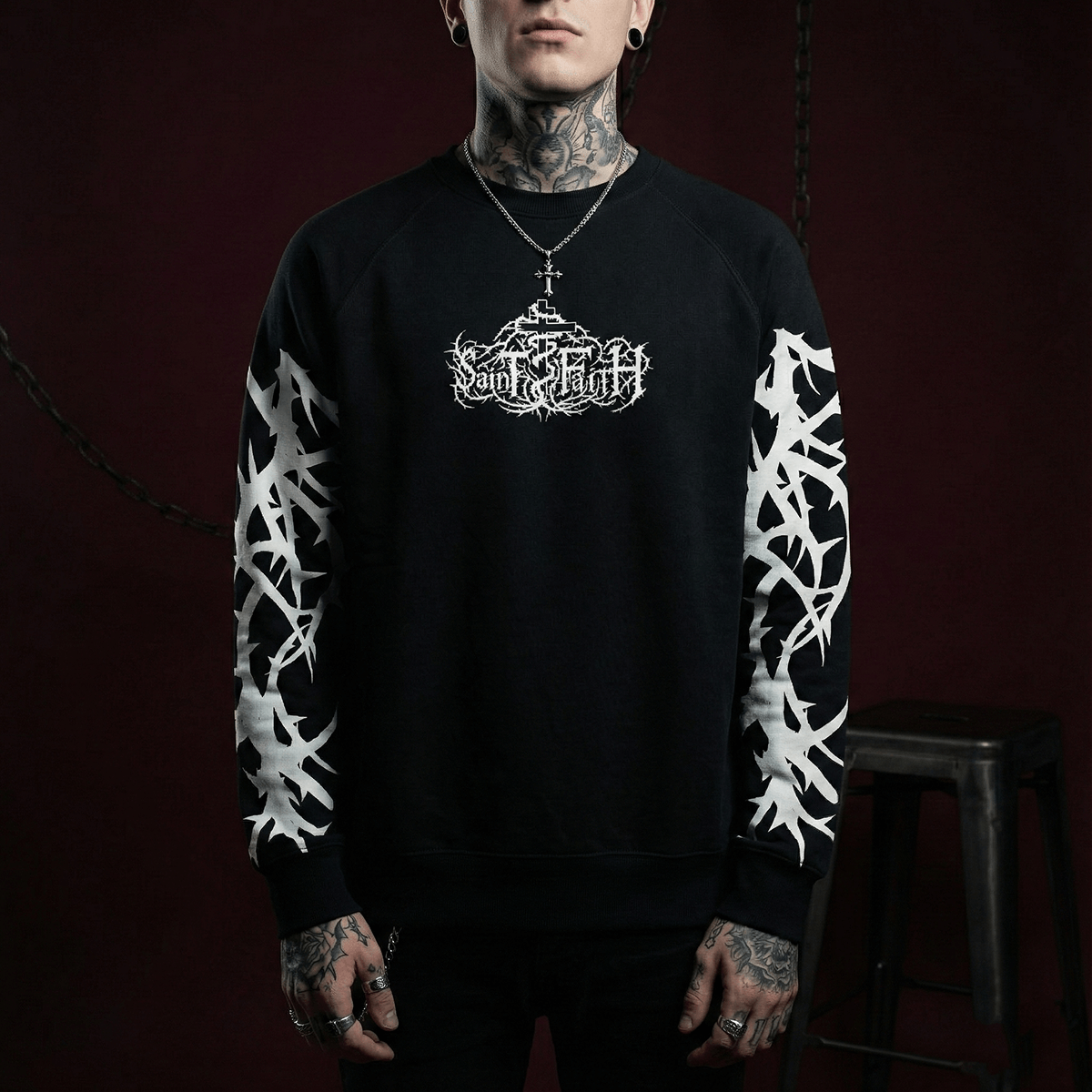
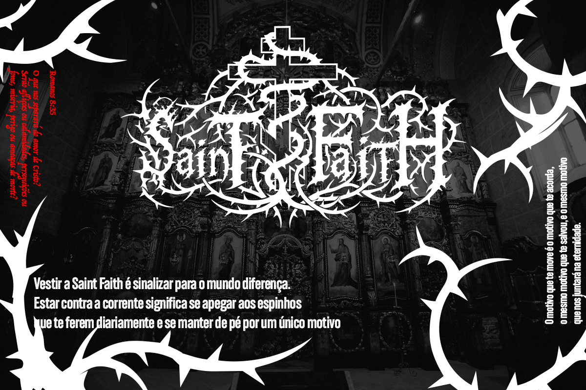
Sacred is a typeface built for apparel prints on hoodies, t-shirts and trousers, with a gothic and alternative Christian theme. It brings Christian elements through a brutal, aggressive aesthetic. The typeface was designed to serve the brutalist Christian clothing brand Saint n Faith, while working just as well in any project with a similar tone.

Brand

Saint n' Faith

Scope

Tipografia & Aplicações

Project date

March 2024

Project objective

The goal was a unique typographic base the brand could use across campaigns, products and materials in a semi templated way, with each print finished by adding final touches. The reference set came from metal band lettering, particularly death and grindcore.

Conceito & Conclusões

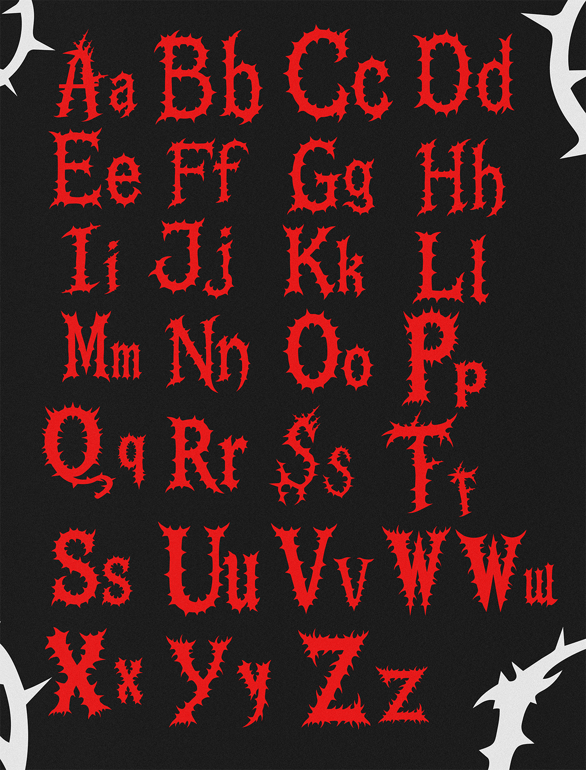
The concept works with thorns, echoing the crown of thorns, in an aggressive and erratic tone while keeping legible strokes and moderate curves as counterpoint to the sharp points. Every letter was drawn individually, in upper and lower case, to have its own character. Being beautiful in isolation was never the criterion. The goal was a wide range of letters, each with a defined concept, so any design team working on a print later would have solid creative ground to build on. The result is a typeface plus support elements that can be bent and manipulated into symbols, words and unique abstractions.

Made to be remembered

VGIA

Brand Identity

October, 2025

VGIA - Ecossistema

CodaxClub

Brand Identity

January, 2026

Codax Club

Terraforte Urbanismo

Brand

November, 2025

Grupo Terraforte Urbanismo

Sacred

Brutal Typography

March, 2024

Sacred Typography

🌐 EN
Português English