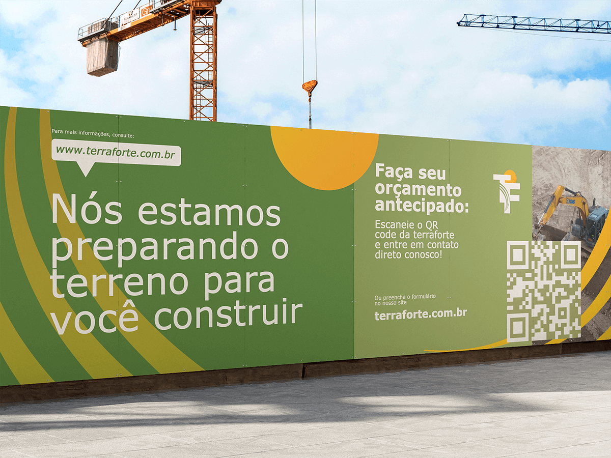
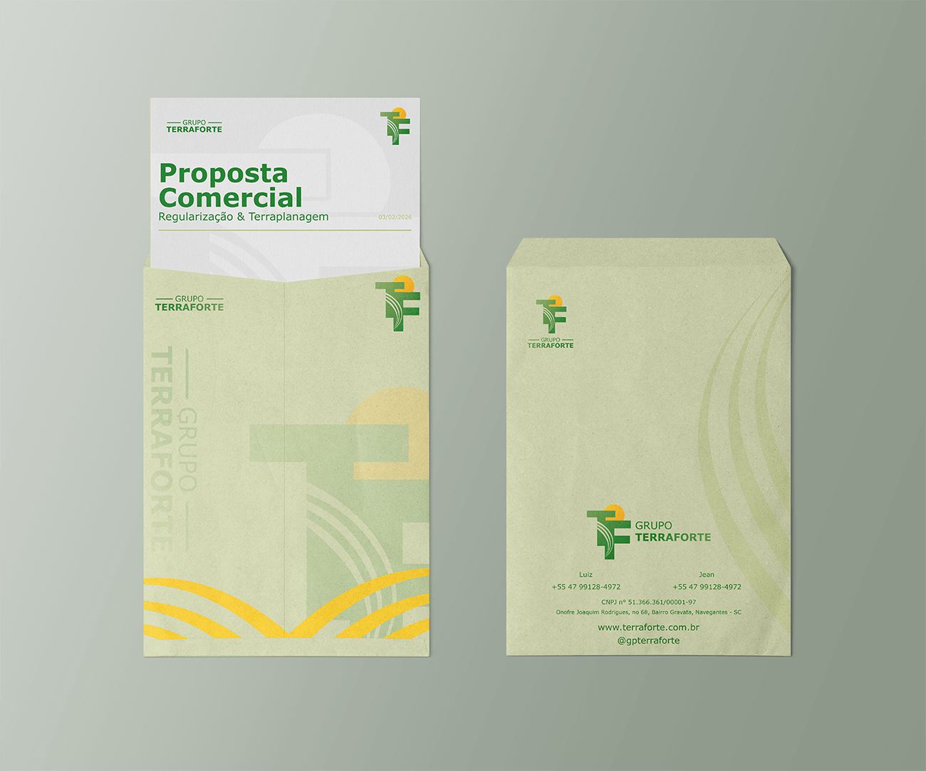
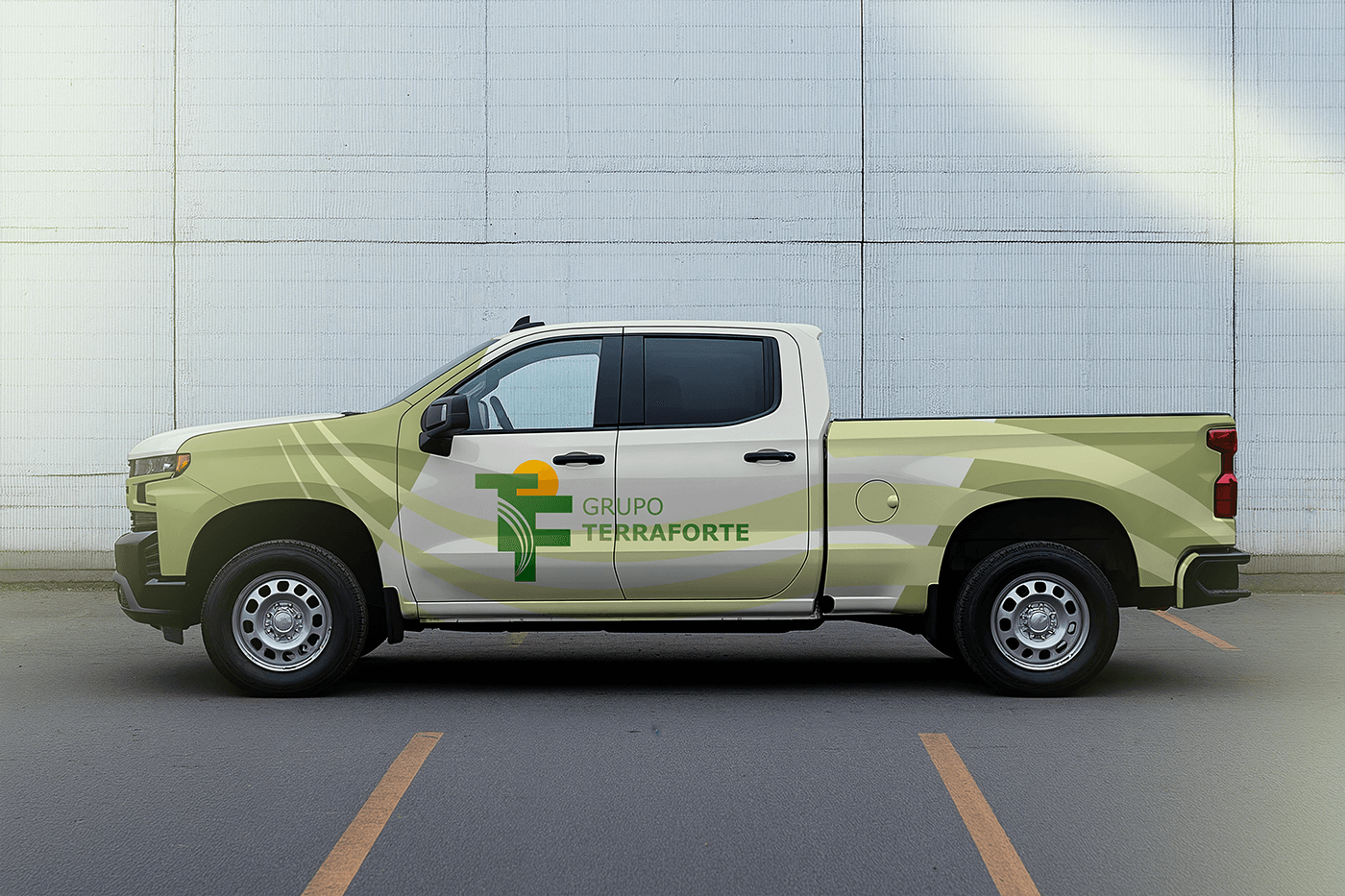
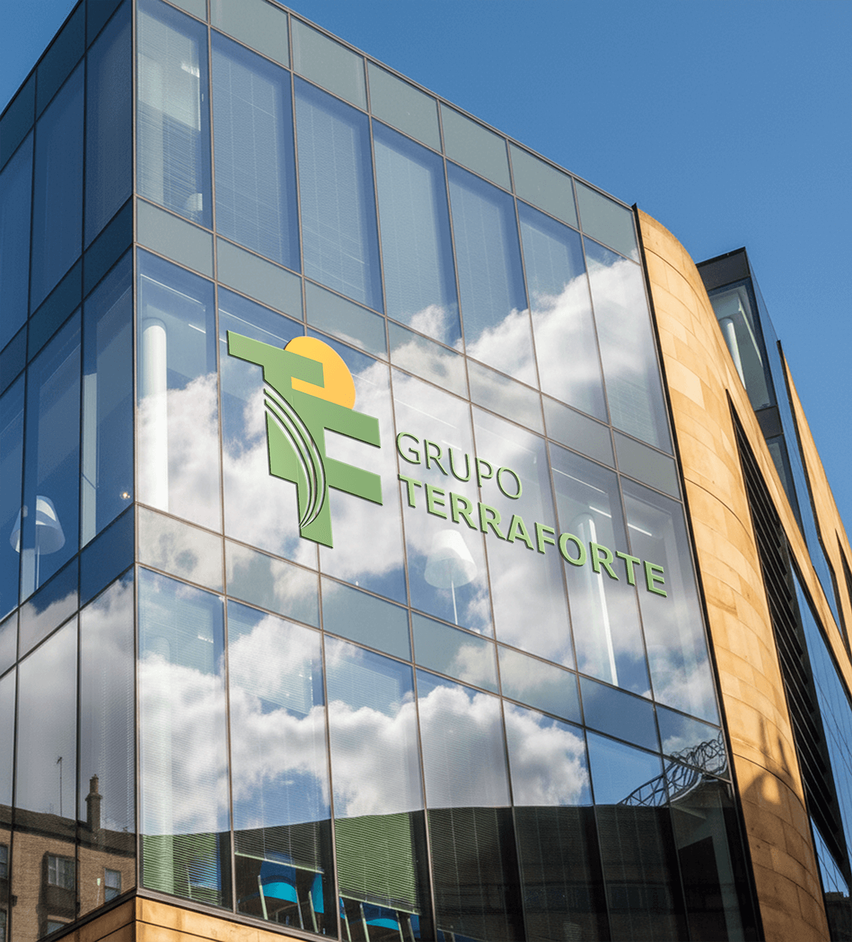
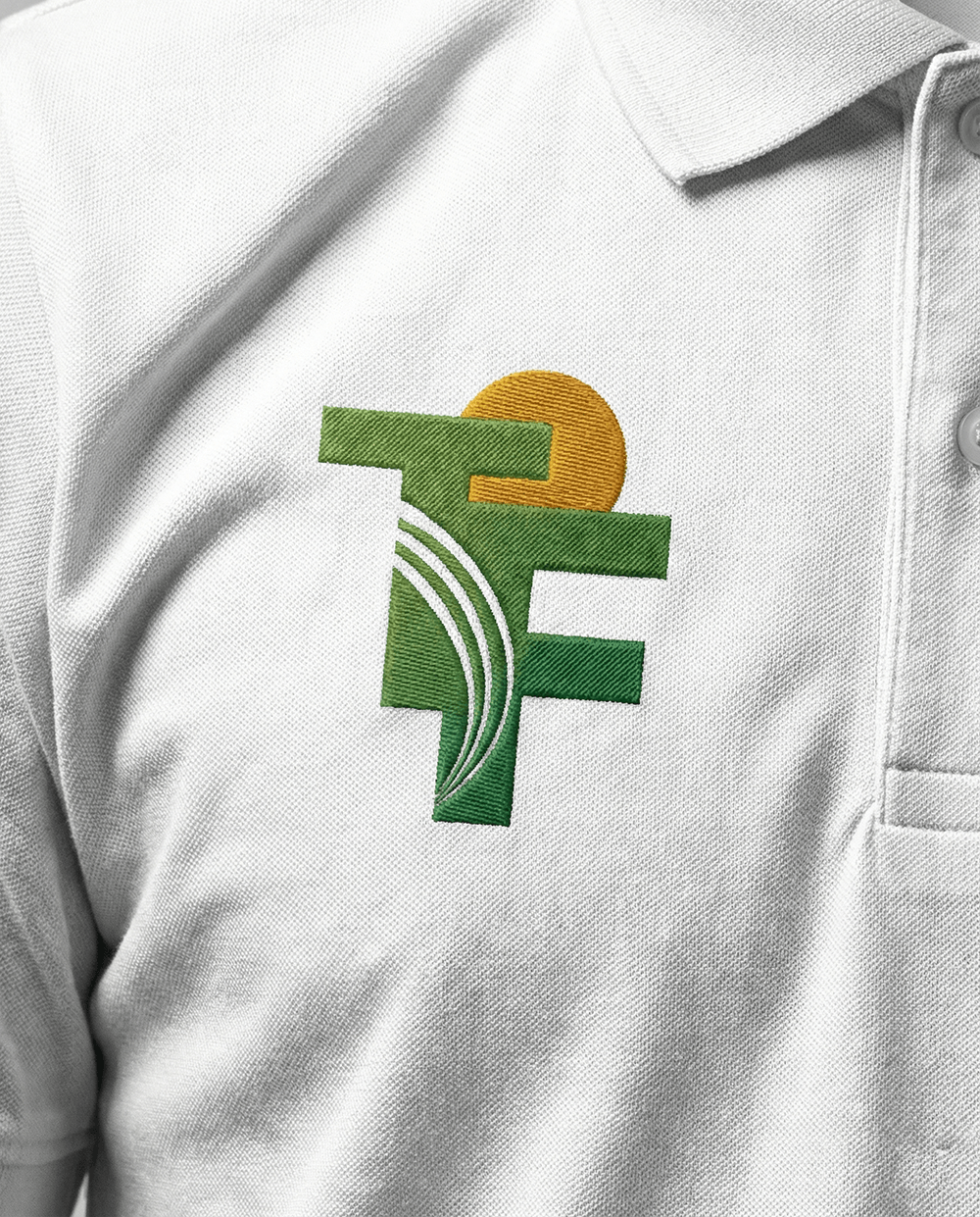
The master concept ties the brand back to land and to the daily routine of every persona. They all have one thing in common, they wake up early, so the sunrise became a graphic element inside the logotype. Every morning a client wakes up, the brand should come to mind as security, as ecosystem and as the reference of its market. The remaining graphic elements follow the same strategic pillars: transparency, trust, direction, accessibility and land. The association is deliberately simple, because it needs to work for every qualified audience of the group.